
Moving from decoration to direction.
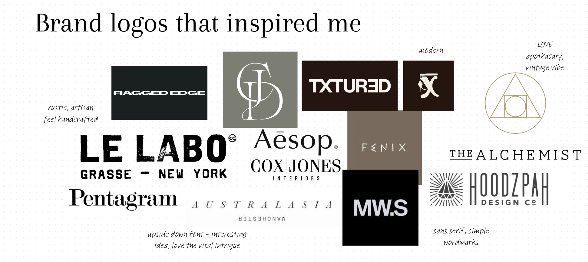
The refresh started with a clear positioning problem: the previous identity did not reflect the level of thinking behind the studio. The new brand needed to feel more intentional, more memorable and more commercially credible, while still feeling personal to me. I researched design studios, luxury brands, editorial layouts, botanical systems, alchemical references, natural textures, type pairings and visual worlds that felt considered rather than trend-led.
Defining the visual world.
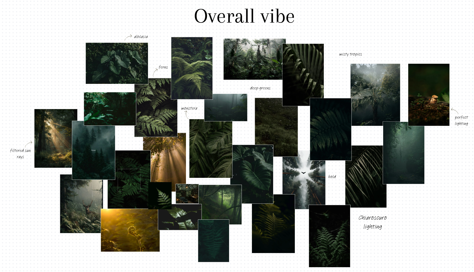
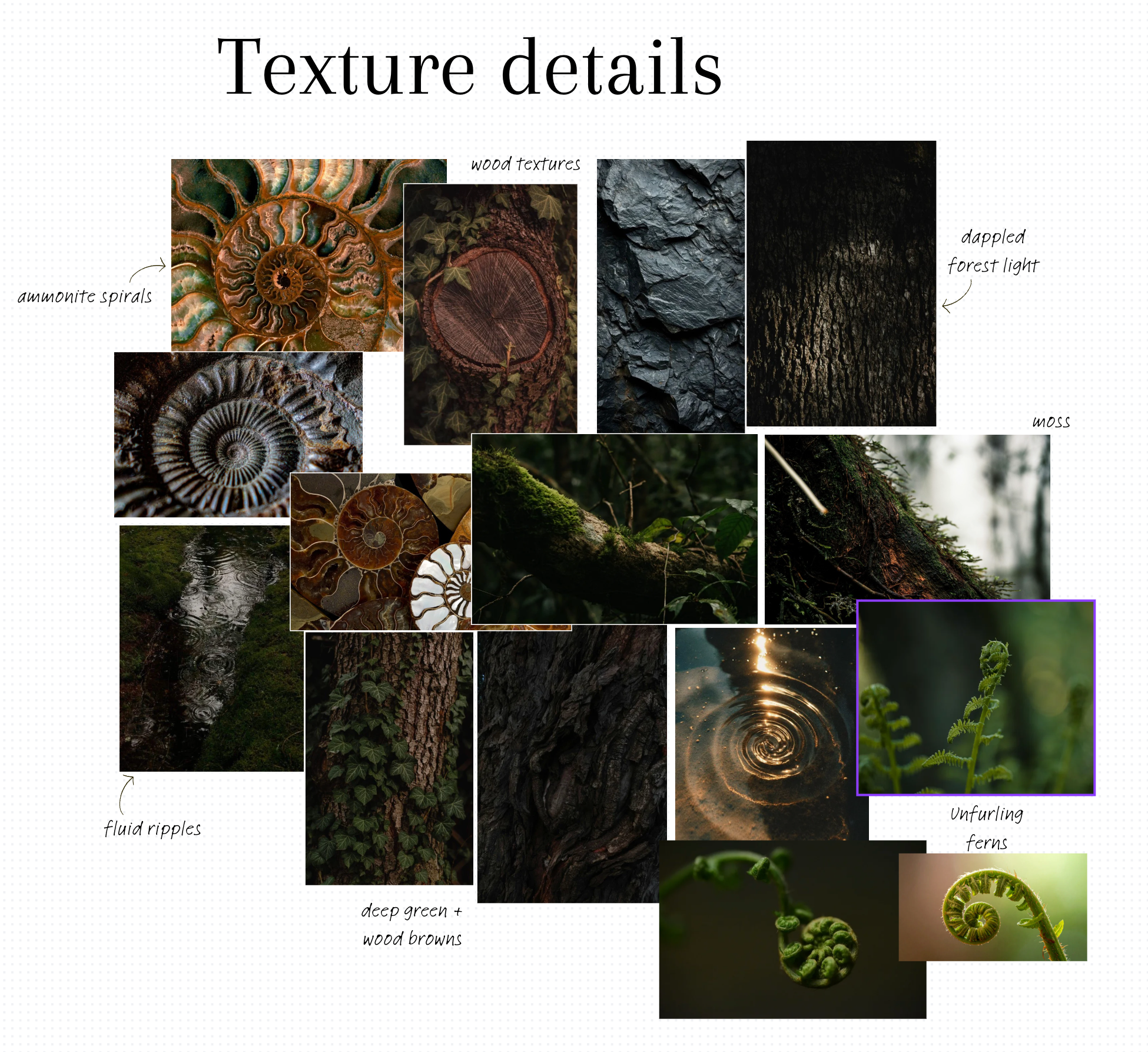
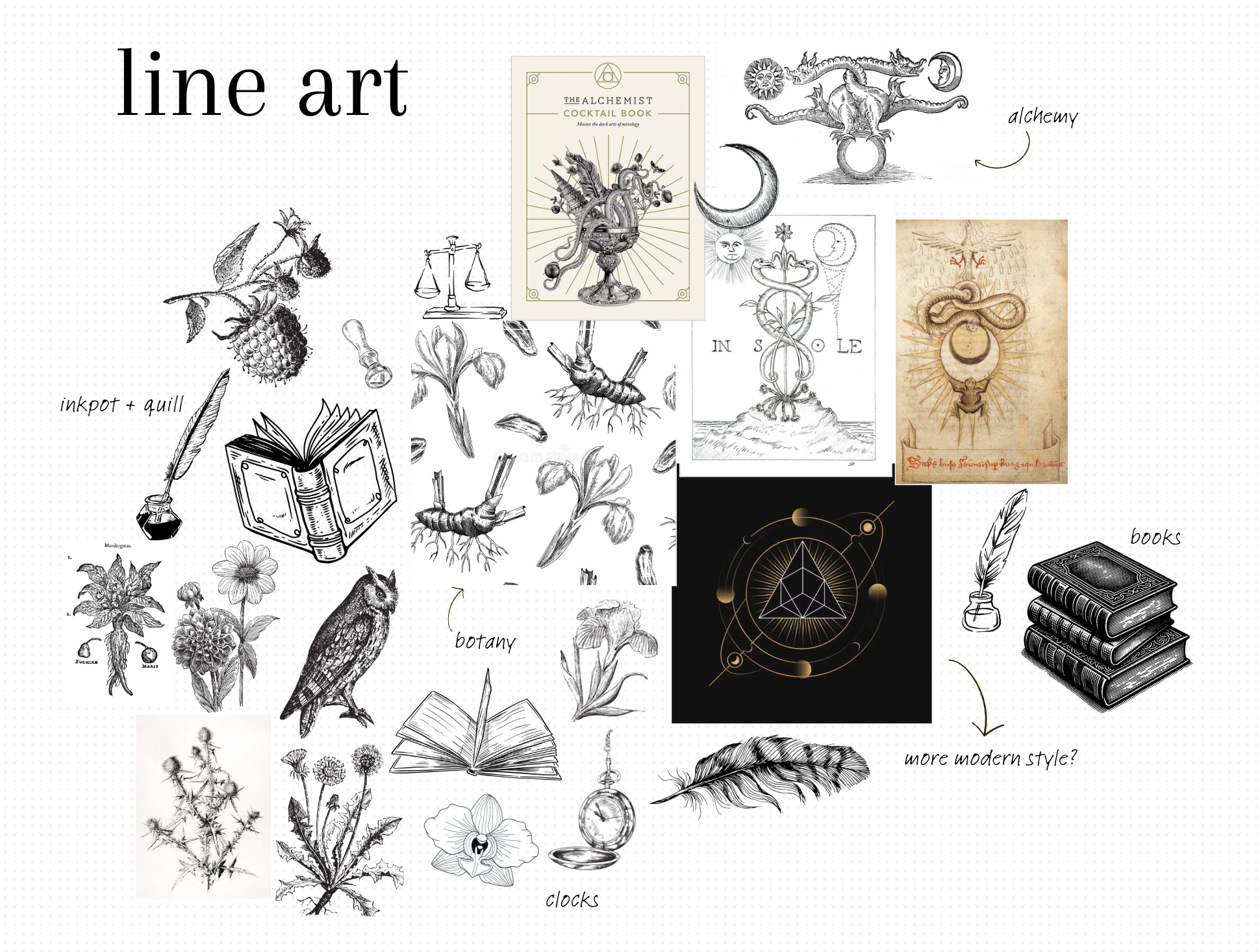
The moodboard defined the world of the Branded by Em identity specifically, not a fixed style for every client project. It brought together deep greens, forest light, ammonite spirals, bark, moss, botanical linework, apothecary details and dark academic references so the studio brand felt layered, tactile and distinctive.
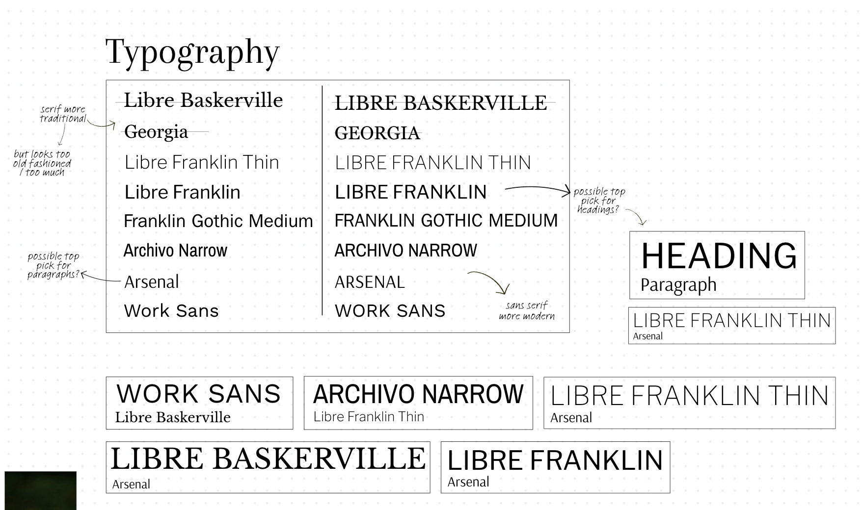
Choosing type with restraint.
The type exploration tested traditional serifs against cleaner sans-serif options. The final direction uses a serif for identity moments because it gives the studio a more established, editorial feel, while the supporting sans-serif keeps website copy, service information and practical content easy to read.
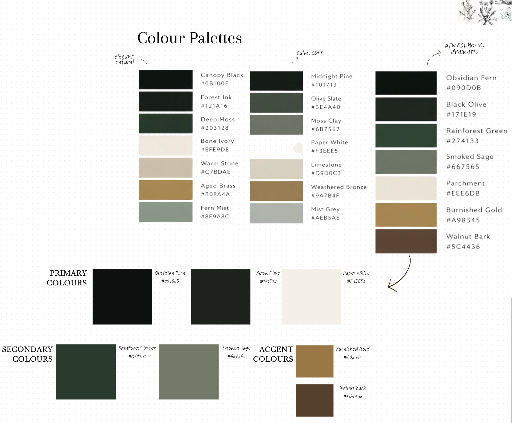
Building a palette with depth.
The final colour system uses parchment as the main canvas, deep greens as the anchor, smoked sage as a softer supporting colour, burnished gold as the refined accent and walnut bark sparingly for warmth. The palette was chosen because it feels premium and grounded, while still giving the website enough contrast to feel polished and clear.
Testing what felt too obvious.
The first logo concepts explored initials, fern specimens, alchemical seals, bookplate-style compositions and unfurling leaf symbols. This stage was important because it showed what looked interesting but did not yet feel ownable, balanced or clear enough for a studio identity.
From fern to ammonite and fern.
The breakthrough came from combining the ammonite spiral with the fern. The ammonite gave the logo structure, rhythm and a link to natural pattern, while the fern brought growth, movement and a connection to the rainforest references. The mark became less literal and more memorable.
Making it work as a real brand asset.
The final stage focused on drawing quality, balance and usability. The ammonite gave the mark structure and rhythm, while the fern created movement and softness. The shell linework, fern placement, colour contrast and spacing were refined so the logo could work as a hero mark, website logo, icon, packaging-style detail and small social asset.