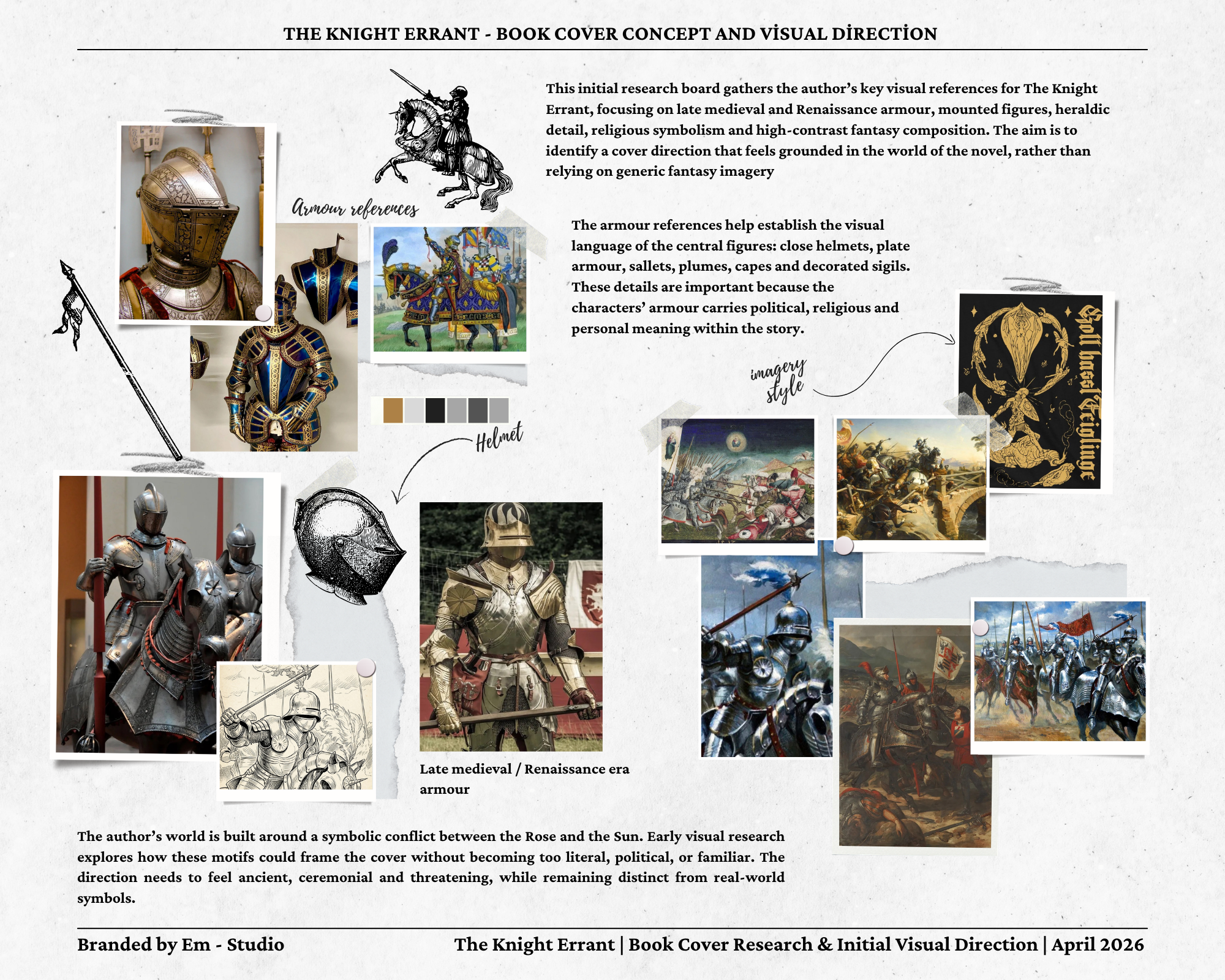
Starting with the world, not the cover.
The first stage was a research board built around late medieval and Renaissance armour, mounted figures, heraldic detail, religious symbolism and high-contrast fantasy composition. The armour references helped define the visual language of the central figure, while the historic paintings and decorative references shaped the tone of the overall composition.
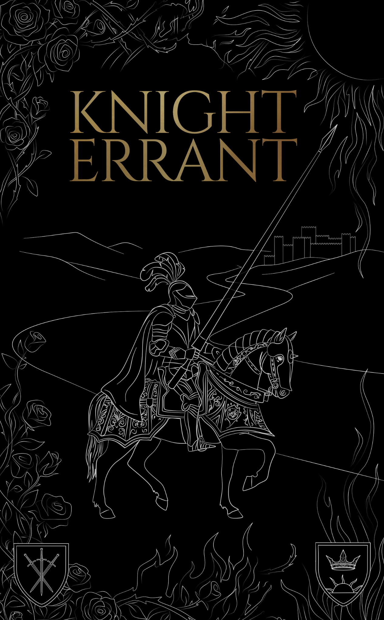
Building the Rose and Sun system.
The author's world centres on a symbolic conflict between the Rose and the Sun, so these motifs became the foundation of the cover. I explored ways to use them as framing devices rather than literal labels, allowing the design to feel ancient, ceremonial and distinctive.
Historical grounding
Armour, helmets, plumes and mounted figures informed the rider and helped the cover feel connected to the world of the book.
Symbolic framing
The rose vines and sun forms were used to hold the composition together and create a sense of conflict around the central figure.
Line language
Fine silver and brass-gold linework allowed the cover to feel detailed, decorative and controlled without becoming visually crowded.
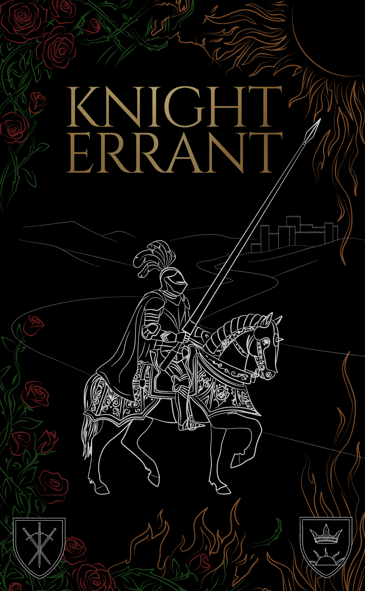
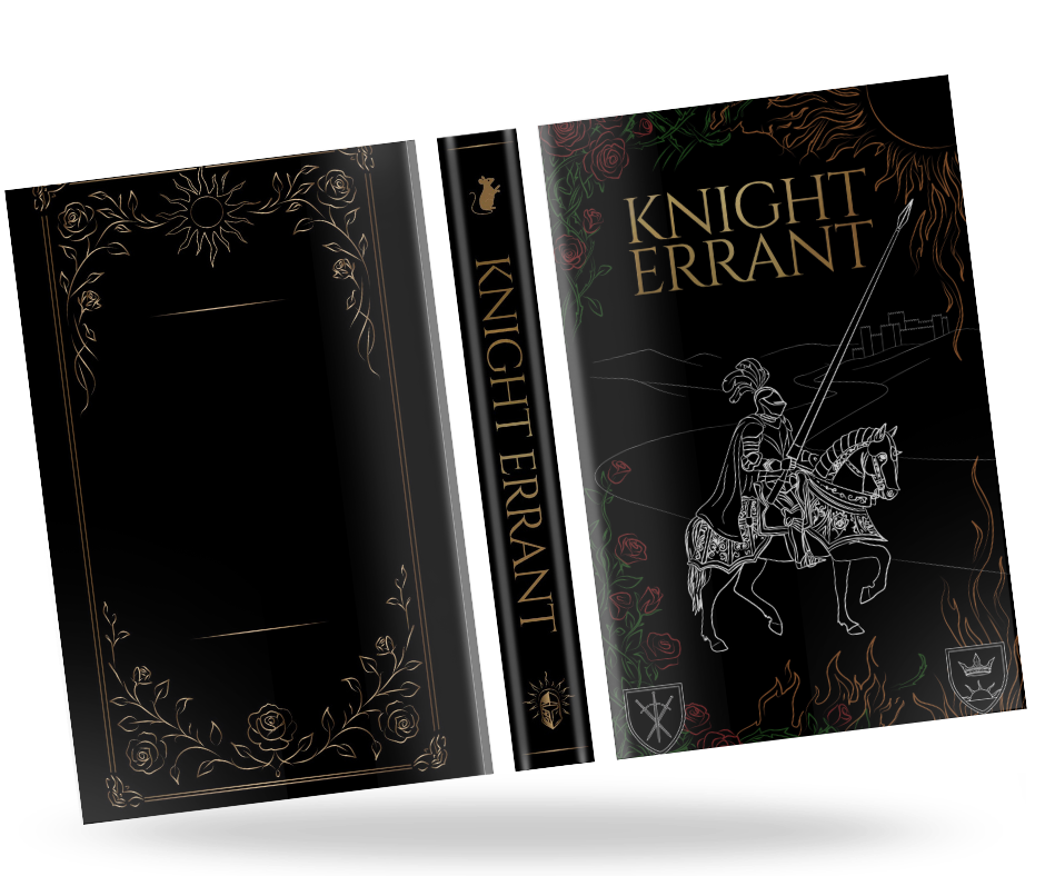
A cover that feels ceremonial.
The final direction uses a black ground, silver illustration, brass-gold title treatment, rose detailing and restrained colour accents. The rider stays central, while the border, shields and symbolic forms make the book feel like an artefact from within the story world.