Creating a calm specialist brand.
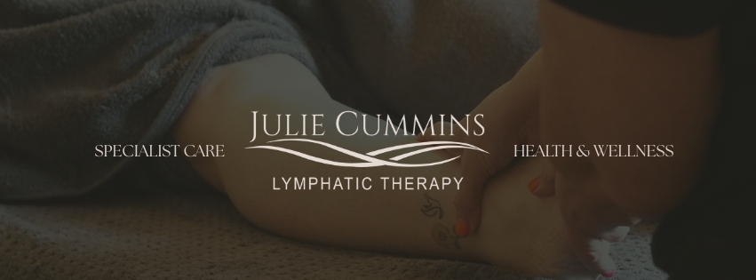
The identity needed to balance softness with professional credibility. The logo uses refined serif typography and flowing linework to suggest lymphatic movement, bodywork and calm restoration without making the brand feel too clinical or too generic.
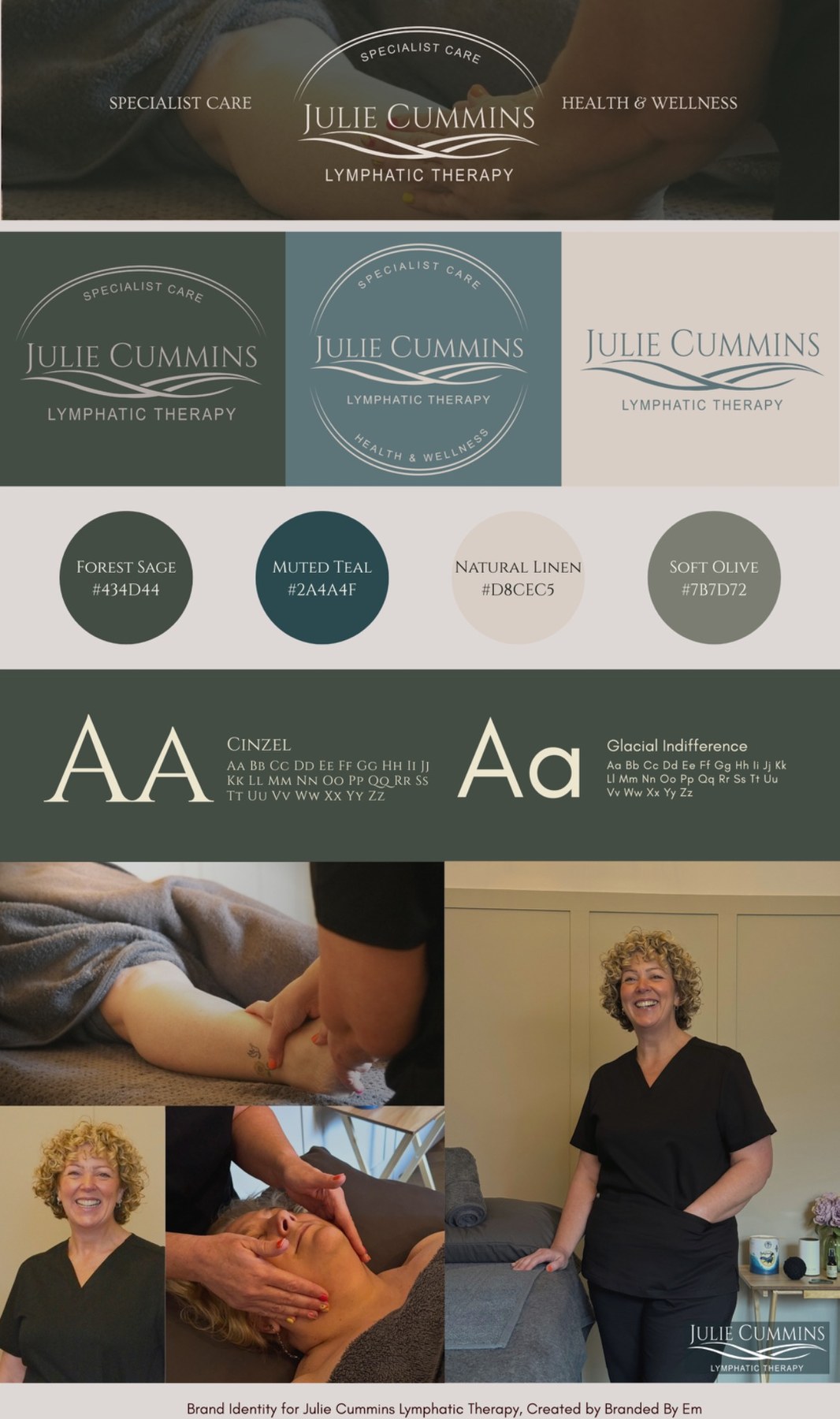
Creating real imagery for the brand.
Alongside the identity, I carried out a photoshoot for Julie so the brand had real, recognisable imagery rather than relying on stock photography. This gave the social content, banners and brand presentation a more personal and professional feel.
Making the brand usable day to day.
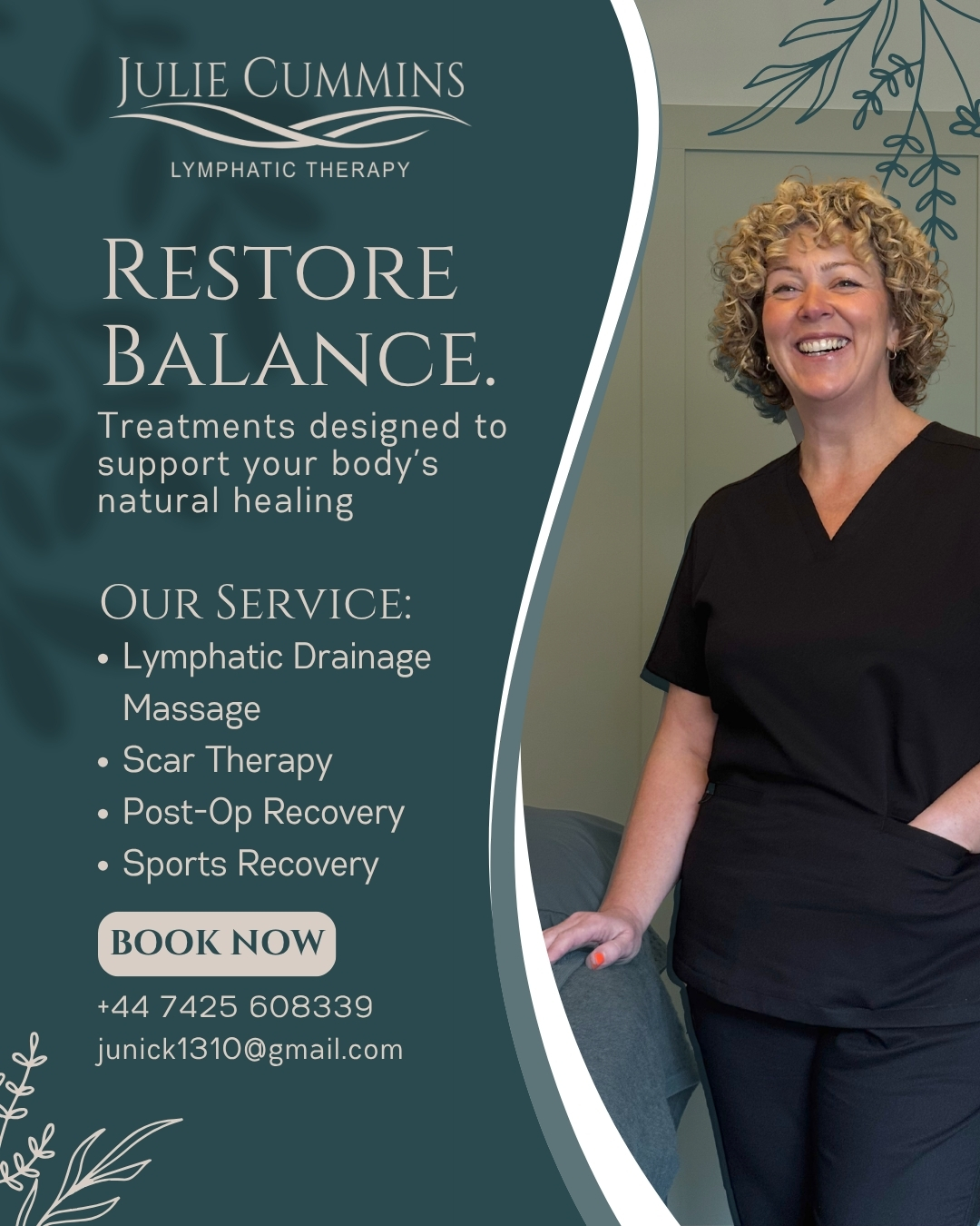
The final social graphics use the brand palette, logo and photography consistently, helping the business feel established and recognisable across Instagram, Facebook, banners and local marketing touchpoints.
Logo system
Elegant enough for brand presentation, but still clear at smaller social sizes.
Colour palette
Muted teal, sage, linen and soft olive tones created a calm specialist feel.
Content design
Real photography and consistent layout choices made the brand feel personal and trustworthy.